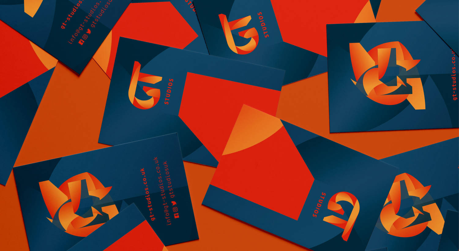
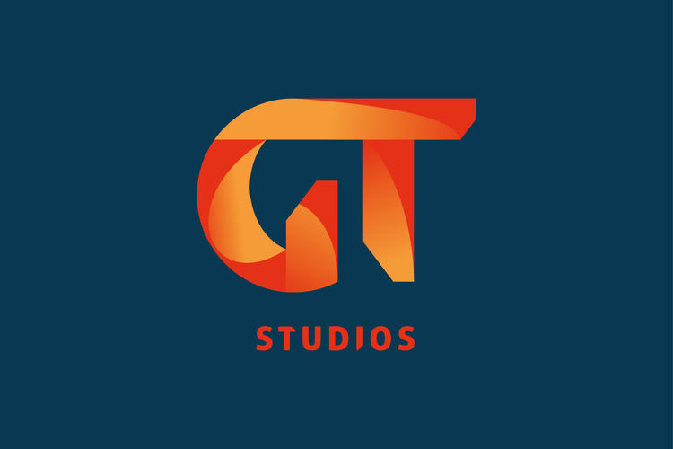
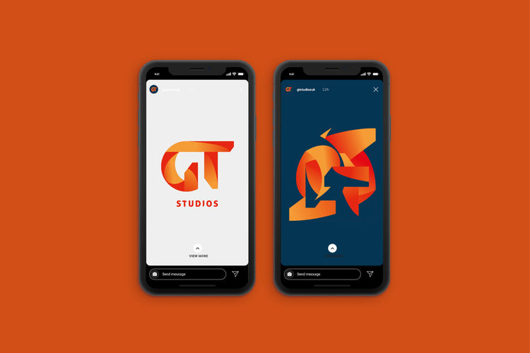
GT Studios is a small group of ambitious young computer game developers getting ready for the launch of their first release. They wanted a brand which is bold, dynamic, and has a playful element to it. It needed to be strong and have personality, but also have ambiguity giving it the ability to work as an umbrella brand to head up a variety of future GT Studios games.
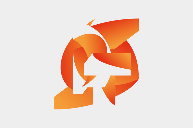
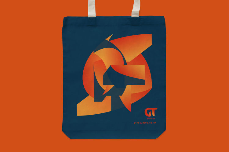
We designed the logo after going through a great many type experiments and treatments. The ‘GT’ letters are made up of 8 elements which come apart to be used as branding elements, creating abstract images and backgrounds. They have been coloured in a way which suggests entering a 3D space, but is also illogical, and gives a subtle sense of movement as the brain tries to make sense of the form’s dimension. During the experimental process, the shape of an axe gradually appeared in the negative space, imbuing the brand with gaming heritage. Bonus!
Work for this project included, gaming research, small focus groups, moodboards, initial sketches, ideas and thoughts, exploration of development. In addition to the identity we also created a number of animations to show how the identity can be adaptable.
