Launched in 2000, Pantone’s colour of the year is based on industry trends in areas as varied as design and entertainment. The company says its annual colour also influences product and purchasing decisions in industries from graphics to packaging and home furnishings to fashion design.
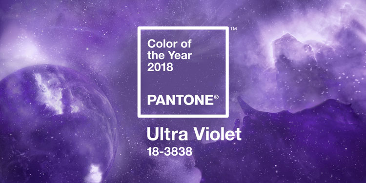
This year’s shade of choice was unveiled this week and is Pantone 18-3838, otherwise known as Ultra Violet. Chosen for its “provocative” and “thoughtful” hue, said Pantone, the colour alludes to the growing trend for wellness and spirituality.
“From exploring new technologies and the greater galaxy, to artistic expression and spiritual reflection, intuitive Ultra Violet lights the way for what is yet to come,” added Pantone Colour Institute executive director Leatrice Eiseman.
It replaces last year’s colour Greenery, which Pantone said was chosen to demonstrate hope during turbulent times.
